Monielink
Monielink
Monielink
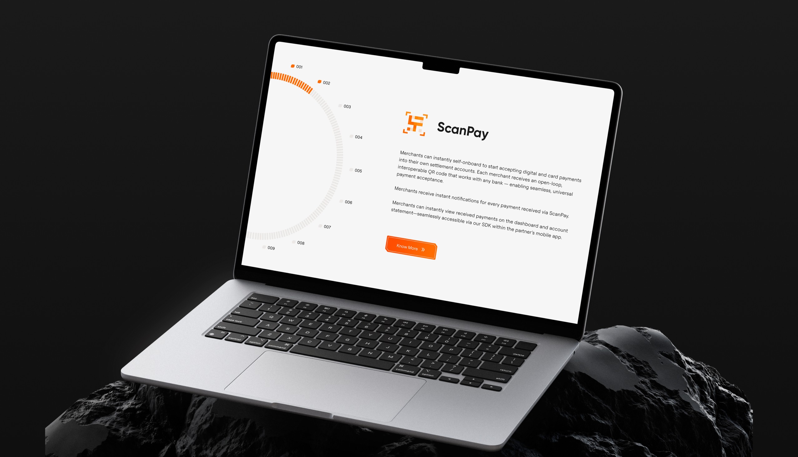
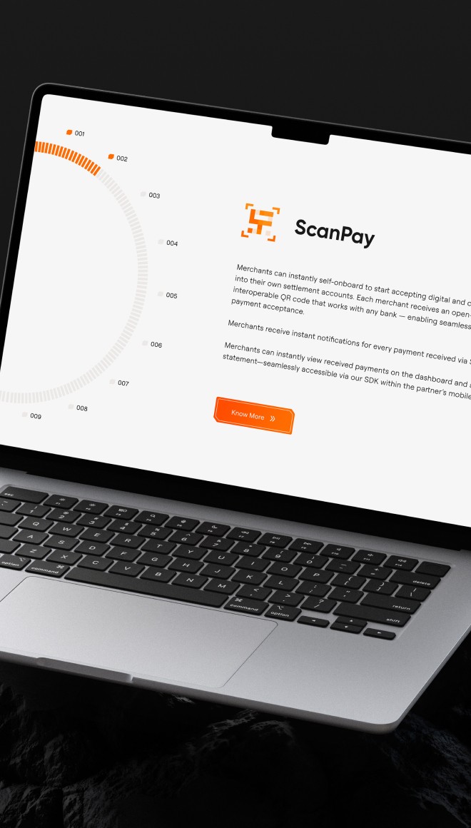
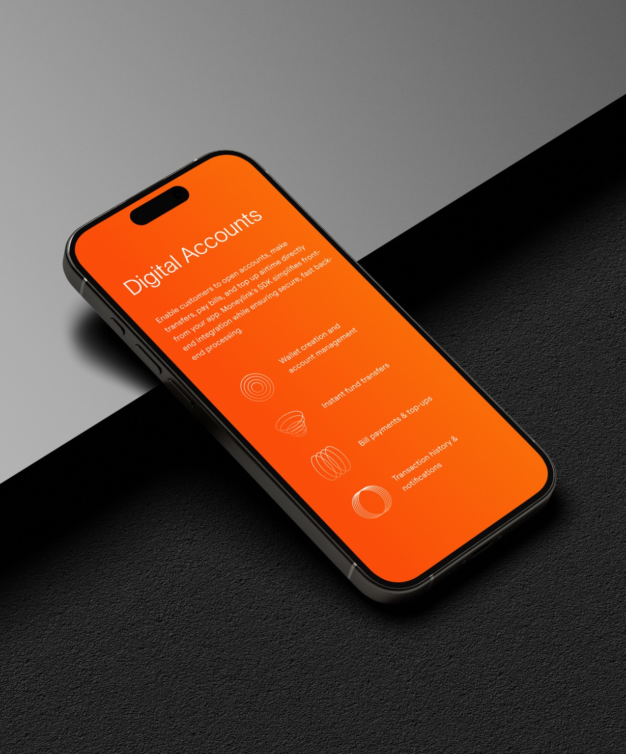
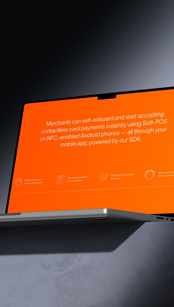
MonieLink is a fintech product under Montra’s ecosystem that helps Nigerian businesses meet compliance requirements and streamline payments. It offers tools like KYC onboarding, transaction monitoring, and regulatory API integration-simplifying Customer Identification Programs (CIP) for digital platforms and financial institutions.


Overview
MonieLink had been operating under Montra’s platform pages with limited visibility and fragmented messaging. The product was growing-but the web presence didn’t reflect its scope, maturity, or value.
The goal was to transition MonieLink from a buried subpage into a standalone digital product website. We focused on building a scalable structure, clear storytelling, and a design system that would support both product marketing and technical onboarding as the platform evolved.
The site is currently in development, but the foundation has been set for a future-ready, product-focused digital experience.


The Challenge
MonieLink lacked a dedicated space to communicate its offering clearly
The content was technical, dense, and buried, creating friction for both buyers and developers
There was no UX structure to support product exploration, documentation, or sign-up flows
The visuals didn’t match the product’s serious, regulation-first tone
Approach
Reframe the Platform as a Standalone Product
We began by mapping the entire MonieLink ecosystem-services, users, flows, and regulatory needs. From that, we developed a scalable sitemap that separates high-level messaging (for business leaders) from detailed API and onboarding content (for developers).
Define a Clear Content Architecture
Each page was built to answer one question at a time:
What is MonieLink? → How does it help? → Who is it for? → How do I start using it?
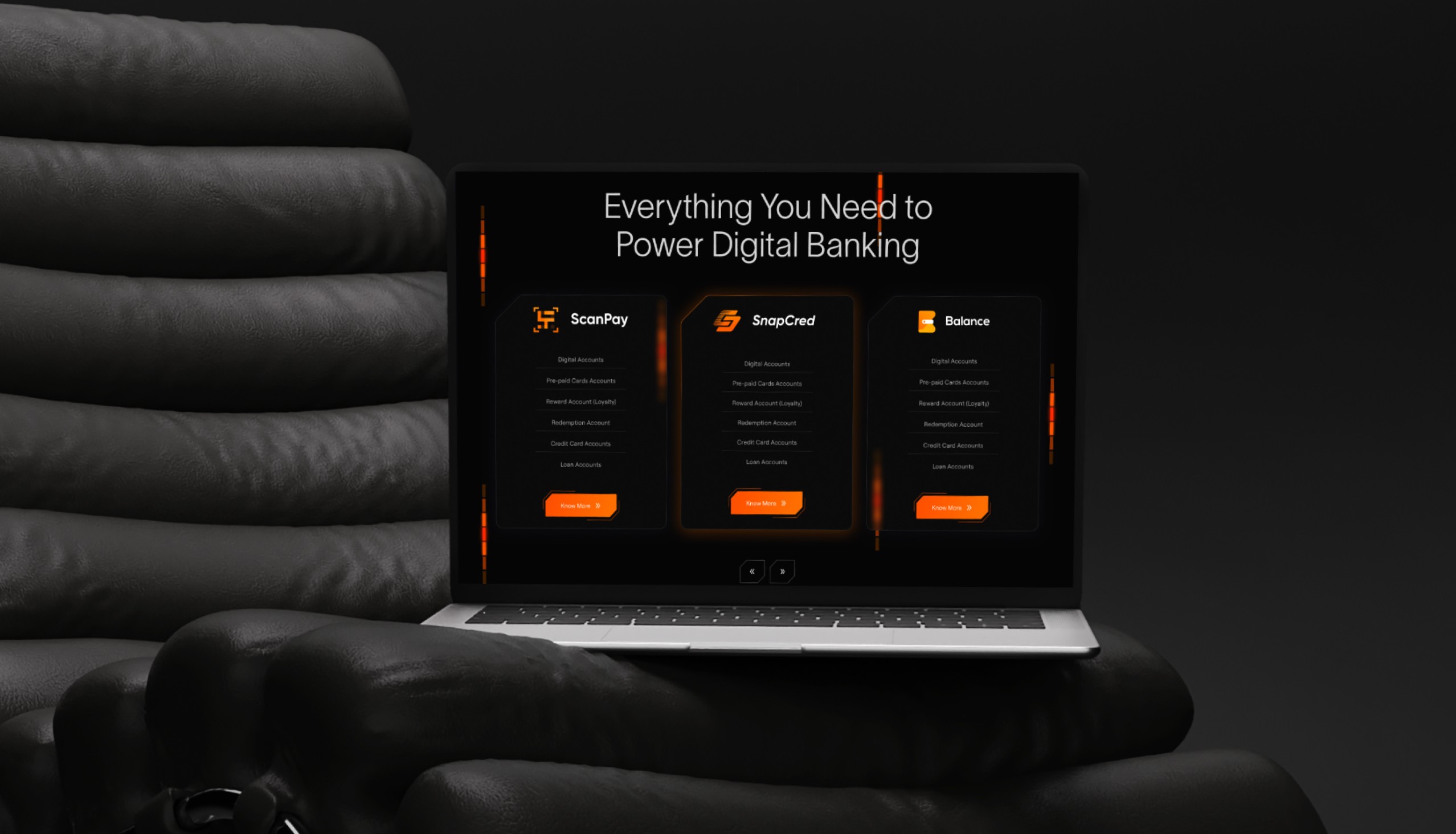
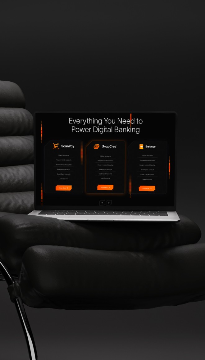
We structured the content into distinct sections:
Overview & Benefits
Use Cases & Industry Relevance
Product Features
Integration Support
Trust, Security & Regulation
Call to Action
Define a Clear Content Architecture
Each page was built to answer one question at a time:
What is MonieLink? → How does it help? → Who is it for? → How do I start using it?
We structured the content into distinct sections:
Overview & Benefits
Use Cases & Industry Relevance
Product Features
Integration Support
Trust, Security & Regulation
Call to Action
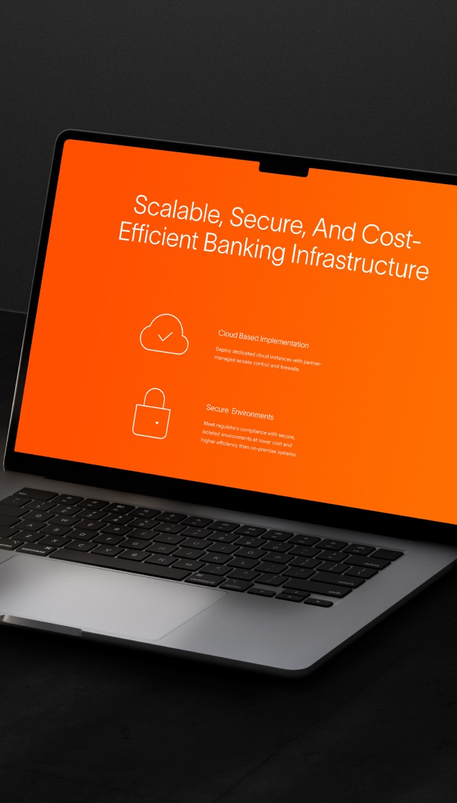
Create a Visual Identity That Reflects Stability
The UI is minimal, modern, and built on a muted palette with highlights of deep grey and orange-blending fintech professionalism with subtle energy. We focused on readability, modular layouts, and interaction cues that support trust and usability.
Create a Visual Identity That Reflects Stability
The UI is minimal, modern, and built on a muted palette with highlights of deep grey and orange-blending fintech professionalism with subtle energy. We focused on readability, modular layouts, and interaction cues that support trust and usability.
Design for Growth & Flexibility
Since the site is being developed in phases, the design system is built to scale. New pages-like developer docs, pricing, or industry-specific solutions-can be added seamlessly as the platform evolves.
Design for Growth & Flexibility
Since the site is being developed in phases, the design system is built to scale. New pages-like developer docs, pricing, or industry-specific solutions-can be added seamlessly as the platform evolves.


The Outcome
Although the site is still under development, the new direction has already delivered:
A clear, enterprise-focused structure that speaks to both decision-makers and developers
A flexible UI system that balances brand personality with regulatory professionalism
A navigation-first experience, reducing friction and encouraging deeper exploration
A design foundation that supports future content rollouts without heavy rework

Takeaway
Fintech products need more than features-they need clarity and trust.
Pulling a product out into its own space helps it grow into its own story.
A sharp page structure and focused CTA strategy make it easier for users to take action.
Small product teams benefit greatly from design systems that scale with them.
Next
Next
Next
Project
Project
Project
MONTRA
MONTRA
MONTRA

Think I match your freak?
Slide into my inbox- no awkward small talk required 😉
Based in DELHI

UI UX DESIGNER


Feel free to stalk me here!
Think I match your freak?
Feel free to stalk me here!
Think I match your freak?
Based in DELHI
UI UX DESIGNER