Patronum
Patronum
Patronum
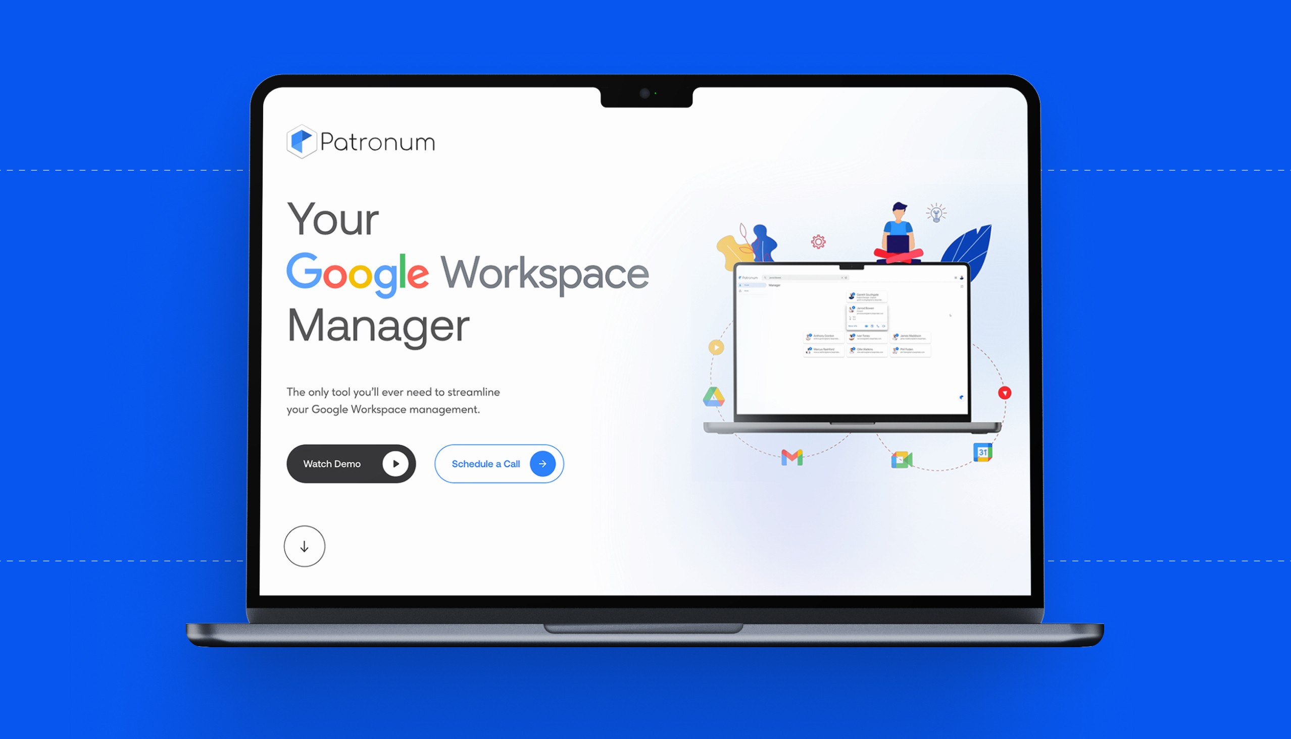
Patronum is a powerful SaaS platform designed to simplify and automate Google Workspace management for IT teams. It helps organizations onboard, offboard, and manage users at scale with minimal manual effort-making it a go-to solution for IT admins seeking control and efficiency.

Overview
Patronum had a strong product but faced noticeable gaps in its website experience. The homepage and key product pages lacked clear messaging, conversion-focused CTAs, and cohesive communication around core features like the 30-day free trial-a major missed opportunity.
The goal of this audit was to identify usability friction, messaging blind spots, and interface inconsistencies, then provide actionable design recommendations that would help improve user clarity, engagement, and trial conversion rates.


The Challenge
While the platform delivers real value, the website experience fell short in communicating it. Key issues included:
Unclear promotion of the 30-day free trial, especially in high-traffic areas like the homepage and pricing pages.
Weak and inconsistent CTAs, leading to confusion about next steps.
Missing or buried onboarding details, reducing user trust and conversion intent.
Disjointed pricing communication, especially for education and nonprofit users.

Approach
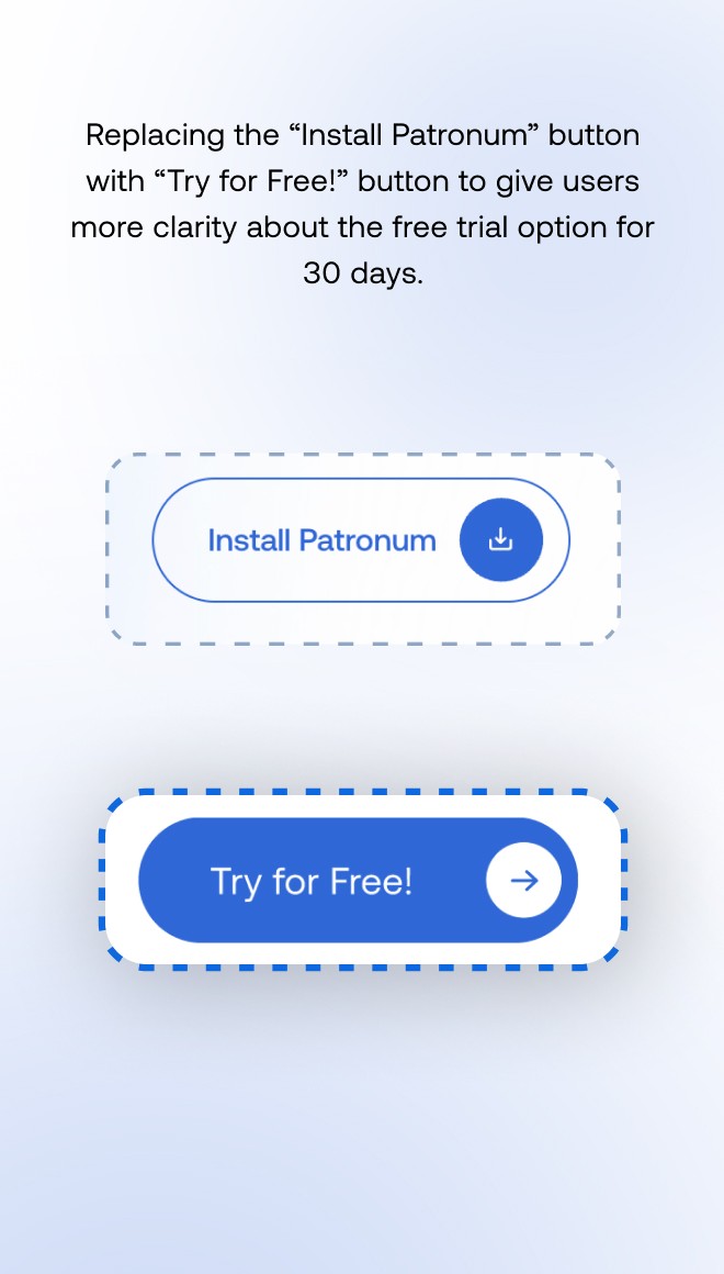
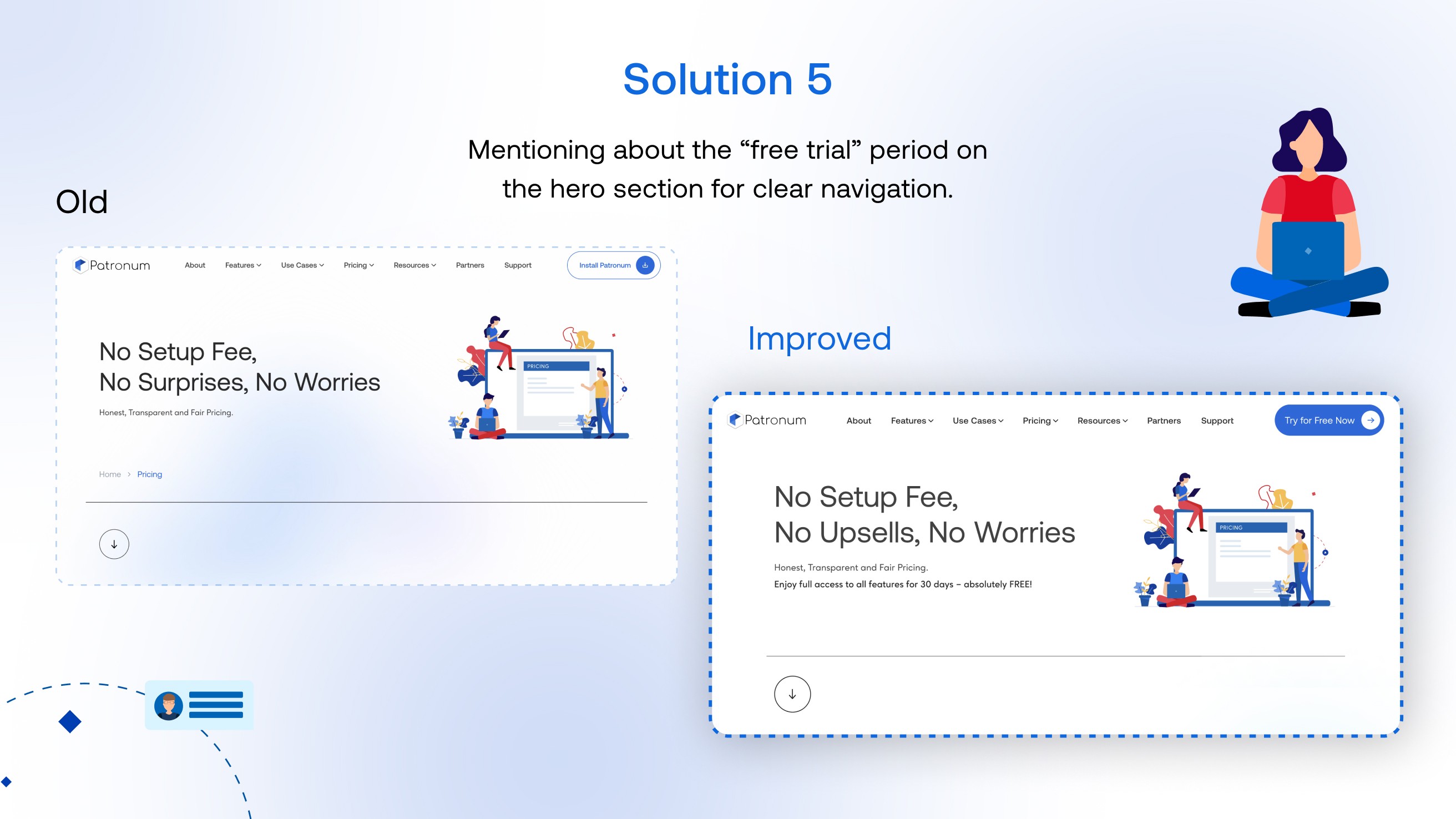
Make the Free Trial Impossible to Miss
We introduced multiple solutions to surface the free trial clearly:
Replaced vague “Install” buttons with bold “Try for Free” CTAs
Included trial messaging in the hero section, next to pricing tiers, and in pop-up forms
Make the Free Trial Impossible to Miss
We introduced multiple solutions to surface the free trial clearly:
Replaced vague “Install” buttons with bold “Try for Free” CTAs
Included trial messaging in the hero section, next to pricing tiers, and in pop-up forms
Make the Free Trial Impossible to Miss
We introduced multiple solutions to surface the free trial clearly:
Replaced vague “Install” buttons with bold “Try for Free” CTAs
Included trial messaging in the hero section, next to pricing tiers, and in pop-up forms
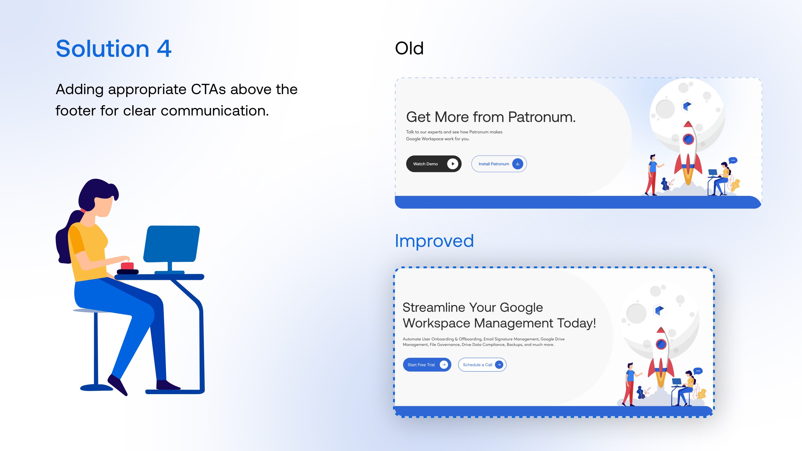
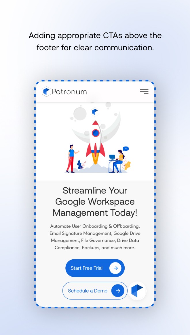
Strengthen CTA Placement and Visual Hierarchy
We proposed enhancing CTA visibility by:
Using high-contrast buttons with clear labels (“Start Free Trial”, “Book a Demo”)
Adding CTAs to About, Features, and Pricing pages
Ensuring every scrollable section has a clear action point
Strengthen CTA Placement and Visual Hierarchy
We proposed enhancing CTA visibility by:
Using high-contrast buttons with clear labels (“Start Free Trial”, “Book a Demo”)
Adding CTAs to About, Features, and Pricing pages
Ensuring every scrollable section has a clear action point
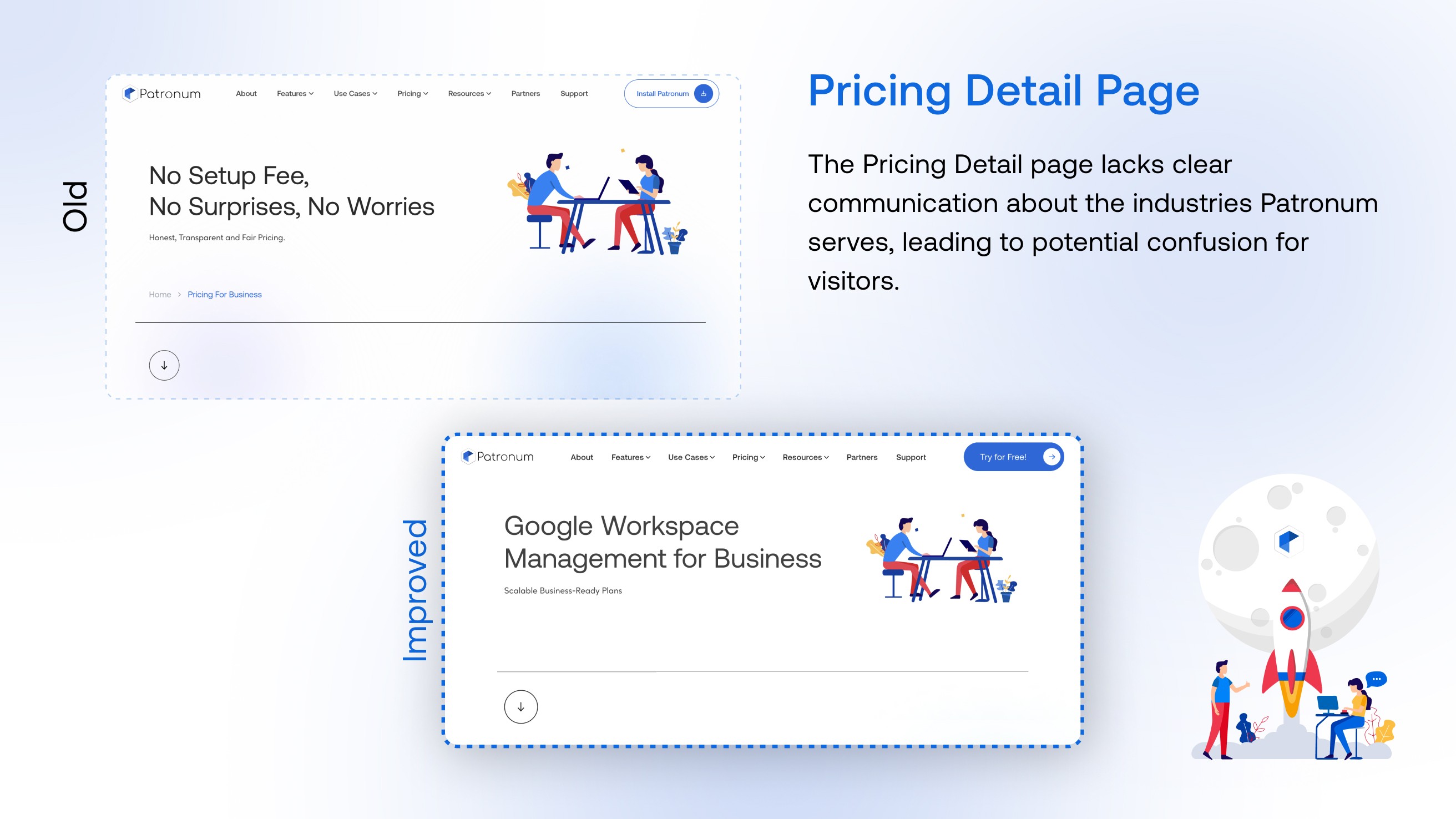
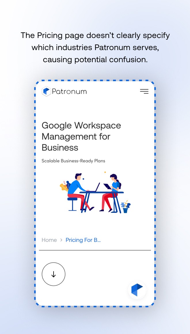
Clarify Pricing Page & Tier Information
Ensured consistency between homepage and pricing page tiers
Added a section clarifying industries served
Simplified layout to reduce friction and support quicker comparisons
Clarify Pricing Page & Tier Information
Ensured consistency between homepage and pricing page tiers
Added a section clarifying industries served
Simplified layout to reduce friction and support quicker comparisons
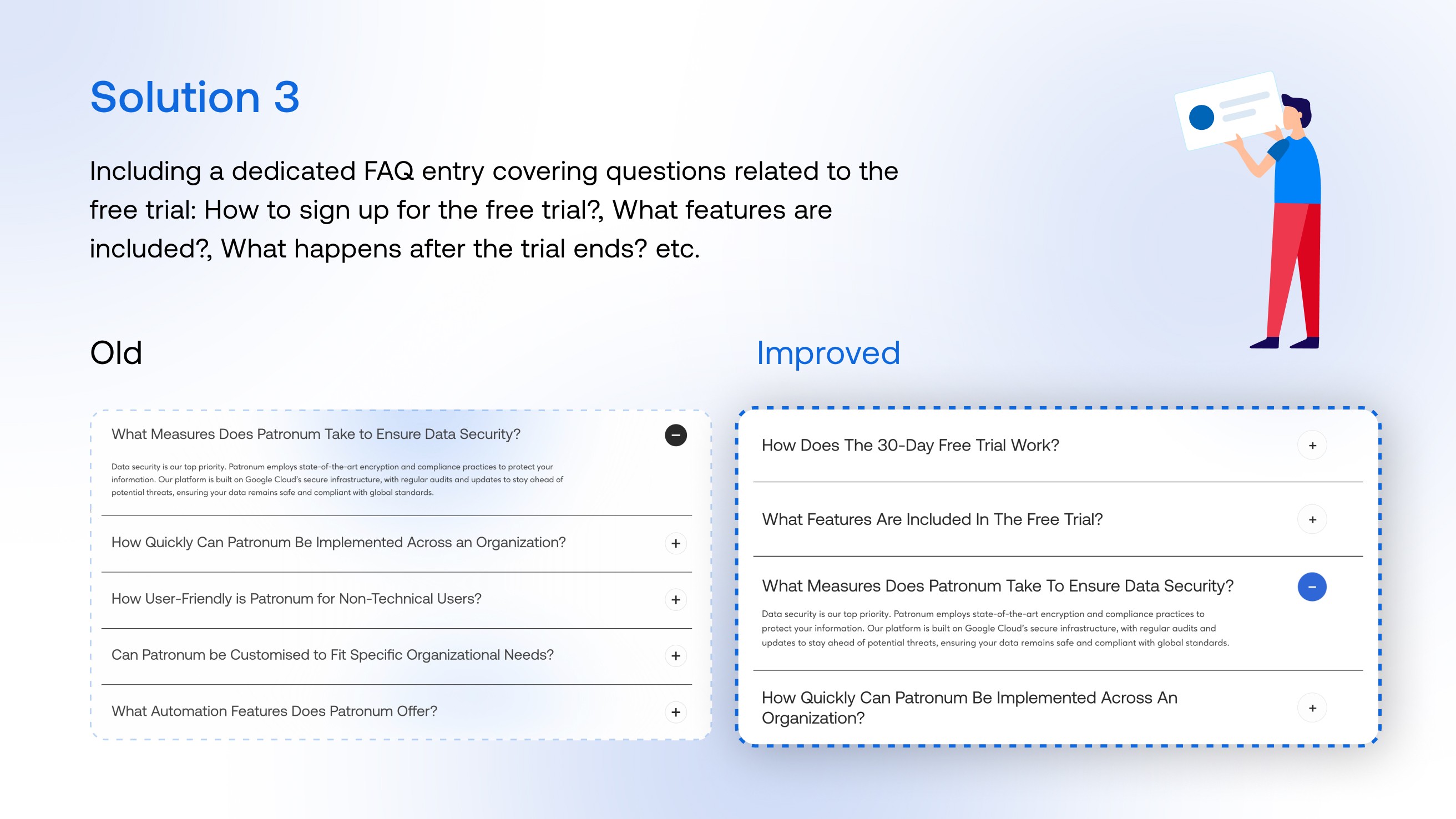
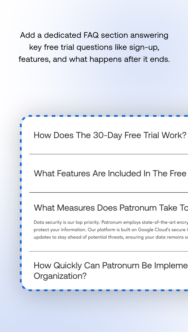
Support New Users with FAQs and Onboarding Clarity
Added a dedicated Free Trial FAQ section
Updated onboarding messages to clearly state the 30-day trial period and what it includes
Support New Users with FAQs and Onboarding Clarity
Added a dedicated Free Trial FAQ section
Updated onboarding messages to clearly state the 30-day trial period and what it includes

The Outcome
While the audit focused on evaluating the current experience and suggesting UX improvements, the implemented changes had a noticeable impact across key performance areas:
+80% increase in free trial sign-ups within the first two weeks after updating CTA structure and trial visibility
32% improvement in CTA click-through rates on the homepage and pricing page
18% decrease in bounce rate across key product pages
2.4x increase in visits to the pricing page following clearer navigation and messaging alignment
Time on site increased by 1.9x, indicating stronger engagement and user interest
Drop-off on onboarding flow reduced by 22% after clarifying trial terms and simplifying entry points
These improvements helped Patronum turn a previously passive site experience into a more focused, conversion-ready funnel-making it easier for users to understand the value and take action.
Takeaway
Conversion doesn’t always need a redesign-small messaging shifts and CTA clarity can make a big impact.
Users don’t read everything-key benefits (like free trials) must be front and center.
Inconsistencies-especially in pricing or product tiers-can damage trust. Fixing alignment improves credibility.
Next
Next
Next
Project
Project
Project
Enigma
Enigma
Enigma


Think I match your freak?


Feel free to stalk me here!
Think I match your freak?
Slide into my inbox- no awkward small talk required 😉
Based in DELHI
UI UX DESIGNER
Feel free to stalk me here!
Think I match your freak?
Based in DELHI
UI UX DESIGNER