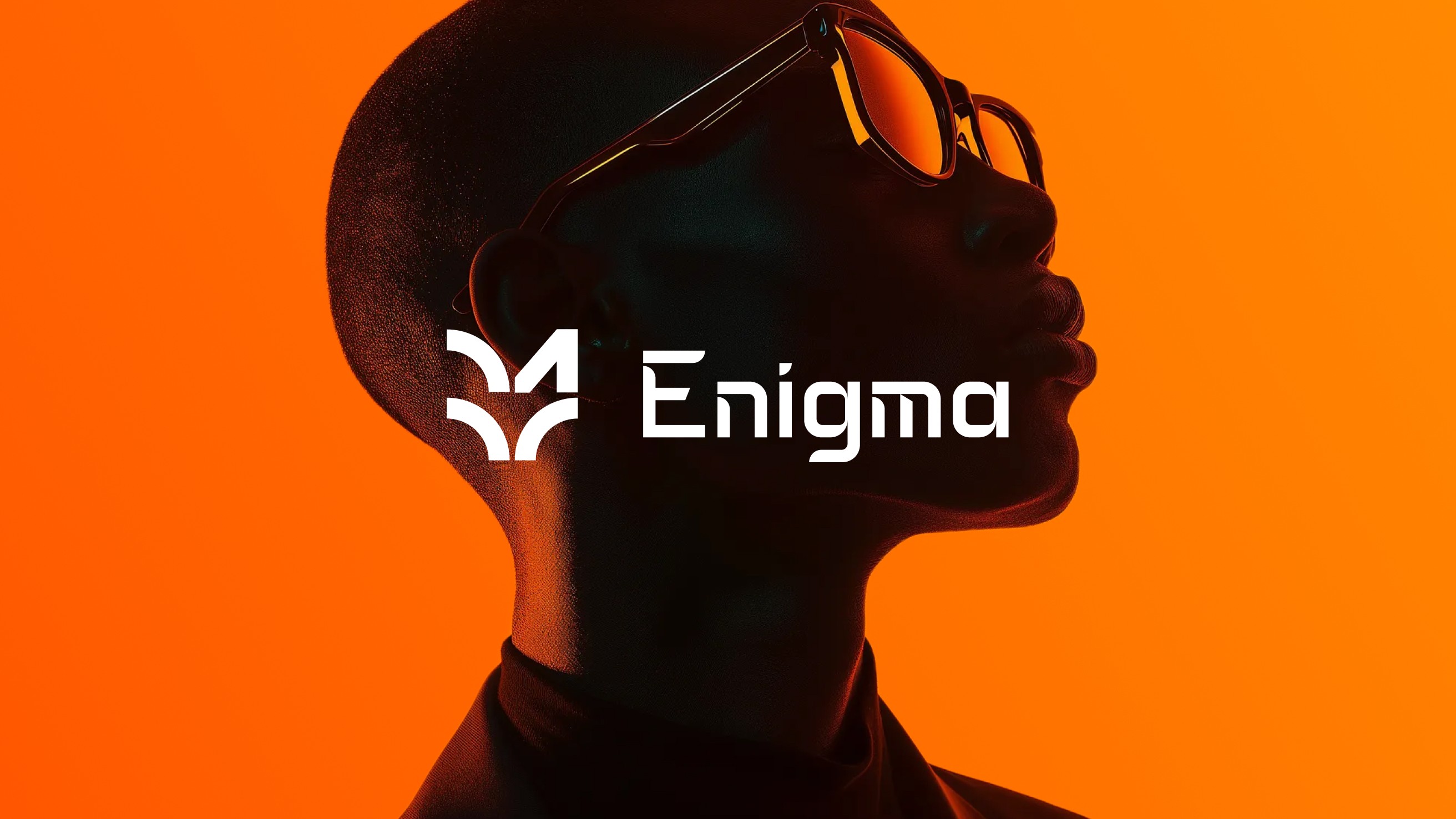
Enigma
Enigma
Enigma
Enigma Digital is a creative agency blending strategy, design, and technology to build bold digital experiences. The team works across branding, websites, and product design-helping startups and enterprises express their edge.
Enigma Digital is a creative agency blending strategy, design, and technology to build bold digital experiences. The team works across branding, websites, and product design-helping startups and enterprises express their edge.


Overview
As the agency scaled, the existing brand identity began to feel mismatched with its evolving direction. The visual language lacked consistency, the tone wasn’t aligned with the team’s creative confidence, and internal templates were all over the place.
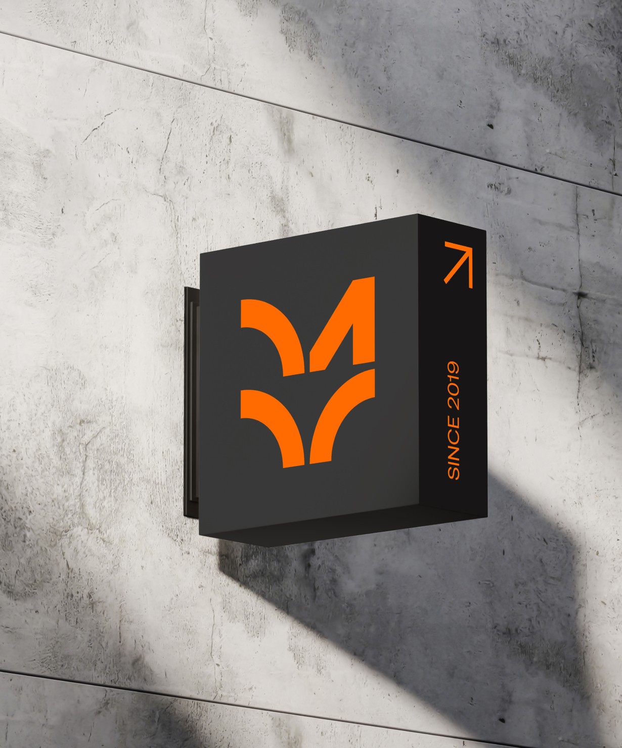
The goal was to create a brand system that felt timeless, minimal, and flexible-built to grow with the agency while letting the work shine.
As the agency scaled, the existing brand identity began to feel mismatched with its evolving direction. The visual language lacked consistency, the tone wasn’t aligned with the team’s creative confidence, and internal templates were all over the place.
The goal was to create a brand system that felt timeless, minimal, and flexible-built to grow with the agency while letting the work shine.


The Challenge
The previous identity leaned generic-safe type, inconsistent templates, and a tone that didn’t reflect Enigma’s bold and experimental spirit. We needed to fix that without over-designing or losing functional simplicity.
Key gaps:
No strong design system across decks, docs, and socials
Lacked visual distinction in a saturated agency space
Brand tone didn’t reflect our culture or digital-first mindset
The previous identity leaned generic—safe type, inconsistent templates, and a tone that didn’t reflect Enigma’s bold and experimental spirit. We needed to fix that without over-designing or losing functional simplicity. Key gaps:
No strong design system across decks, docs, and socials
Lacked visual distinction in a saturated agency space
Brand tone didn’t reflect our culture or digital-first mindset

Approach
Define the Brand Principles
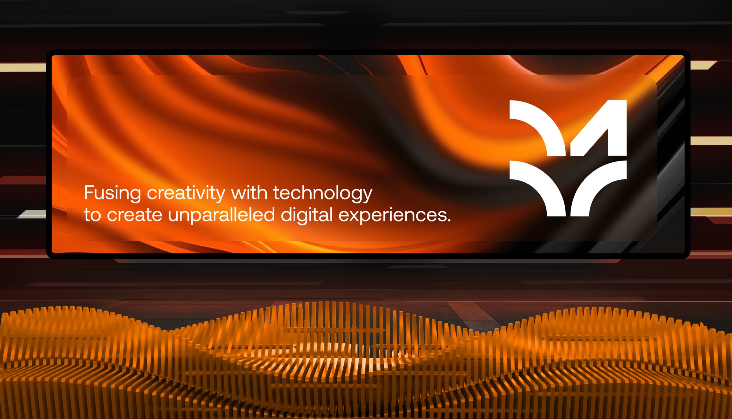
We didn’t want a loud rebrand. We wanted clarity. We grounded the rebrand in three core ideas: bold presence, minimal design, and modern flexibility. The goal wasn’t to over-style, but to create a system that feels sharp, self-assured, and ready to scale.
Define the Brand Principles
We didn’t want a loud rebrand. We wanted clarity. We grounded the rebrand in three core ideas: bold presence, minimal design, and modern flexibility. The goal wasn’t to over-style, but to create a system that feels sharp, self-assured, and ready to scale.
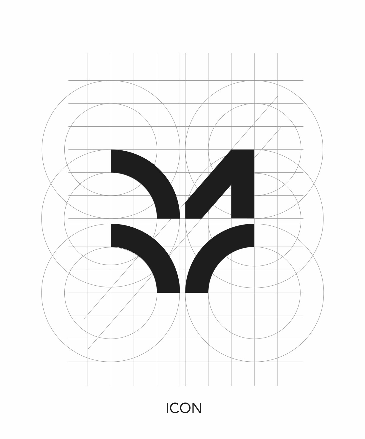
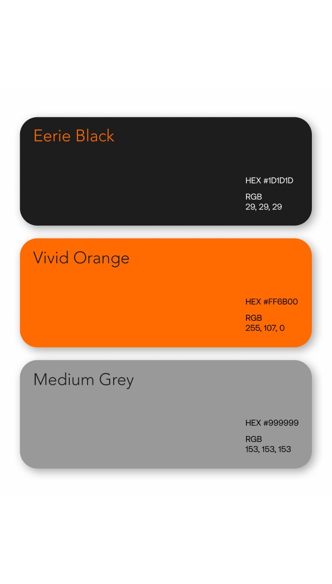
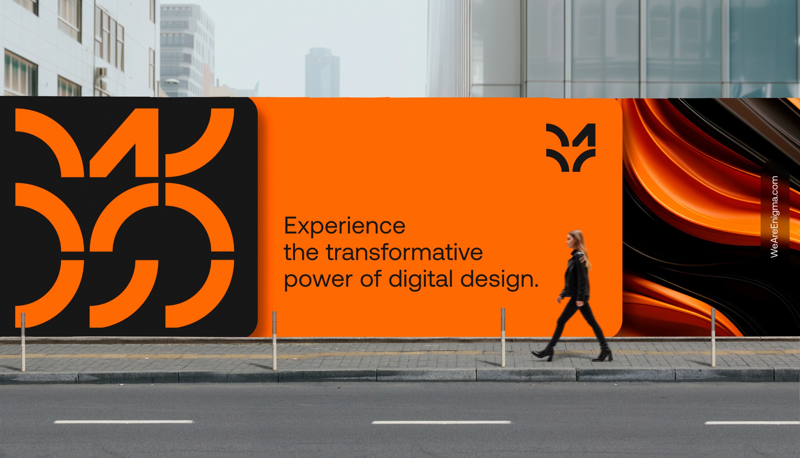
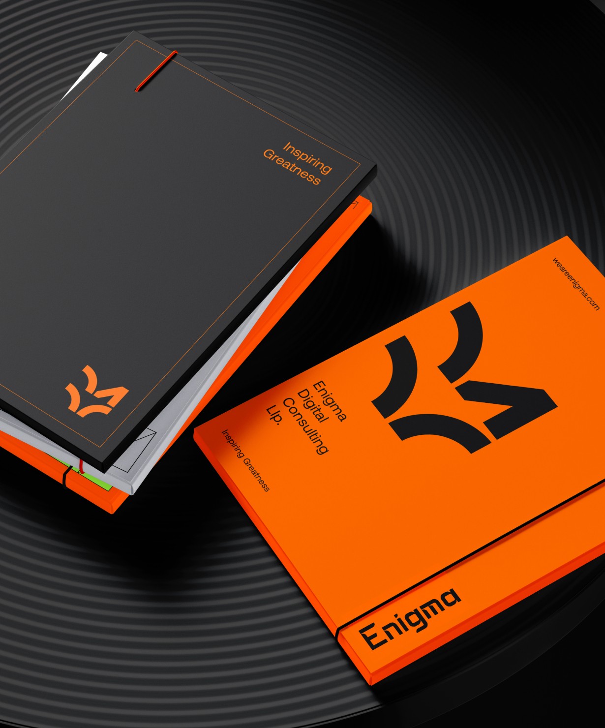
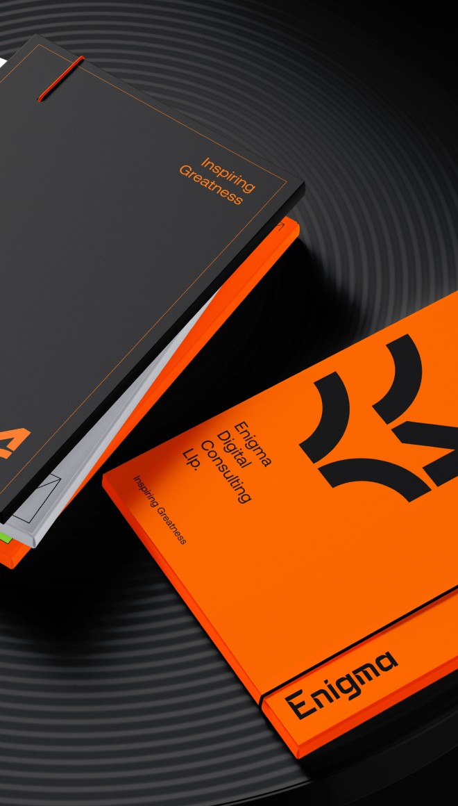
Strip It Back, Build It Right
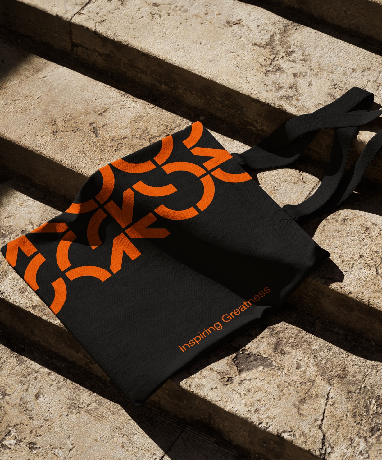
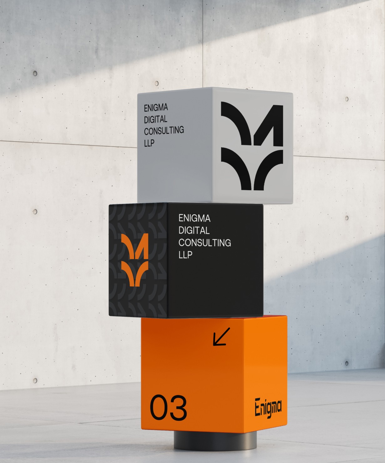
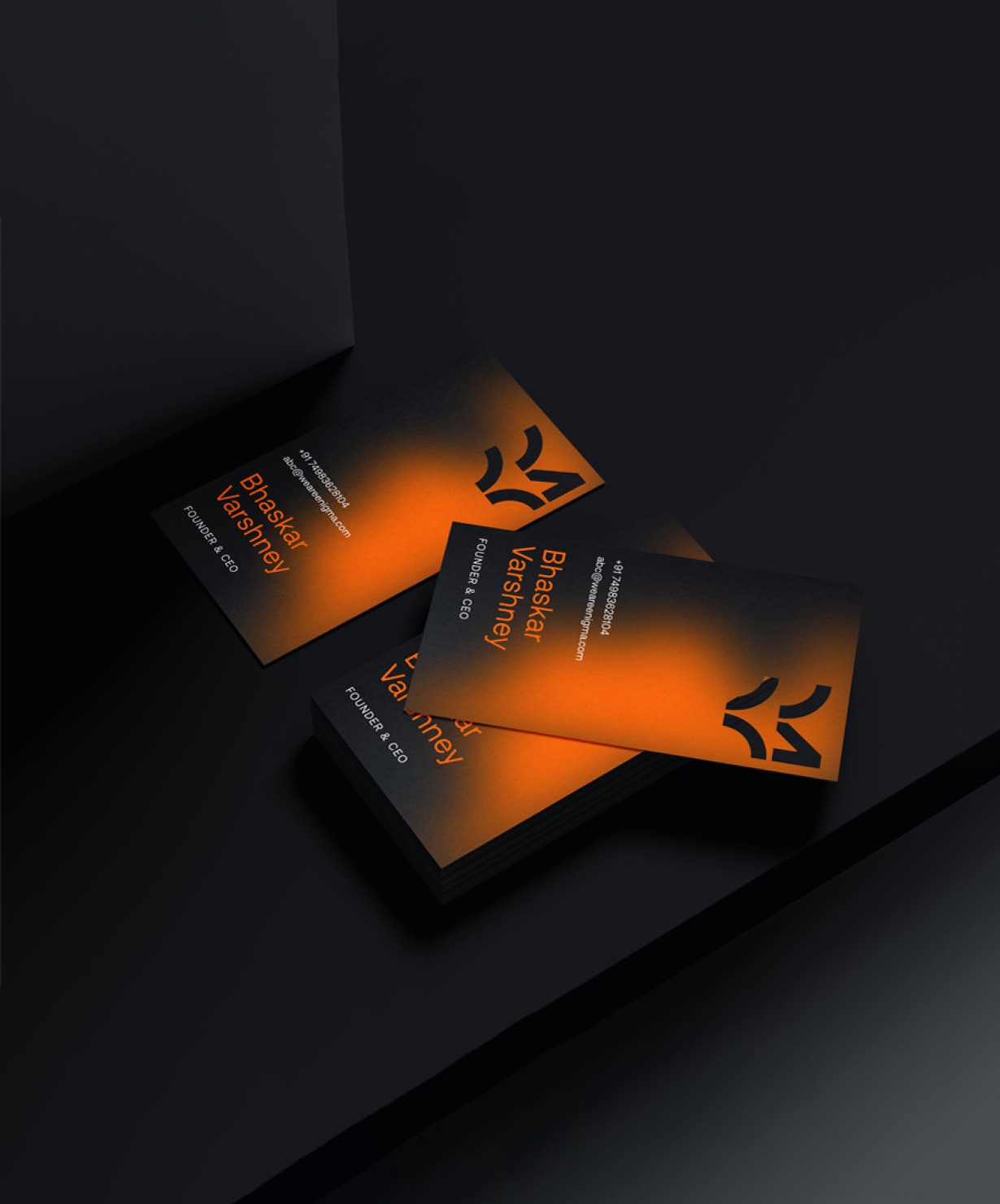
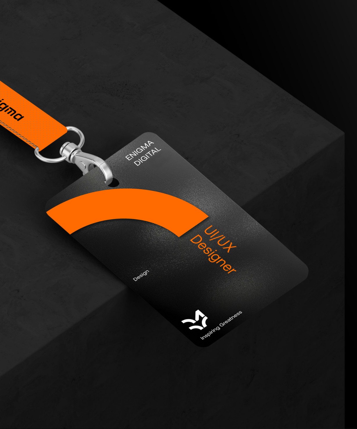
Rather than designing a one-off look, we created a modular design system. Clean grids, neutral colors, and strong typography come together to form an identity that’s versatile across decks, docs, socials, and the web-confident without being loud.
Strip It Back, Build It Right
Rather than designing a one-off look, we created a modular design system. Clean grids, neutral colors, and strong typography come together to form an identity that’s versatile across decks, docs, socials, and the web-confident without being loud.
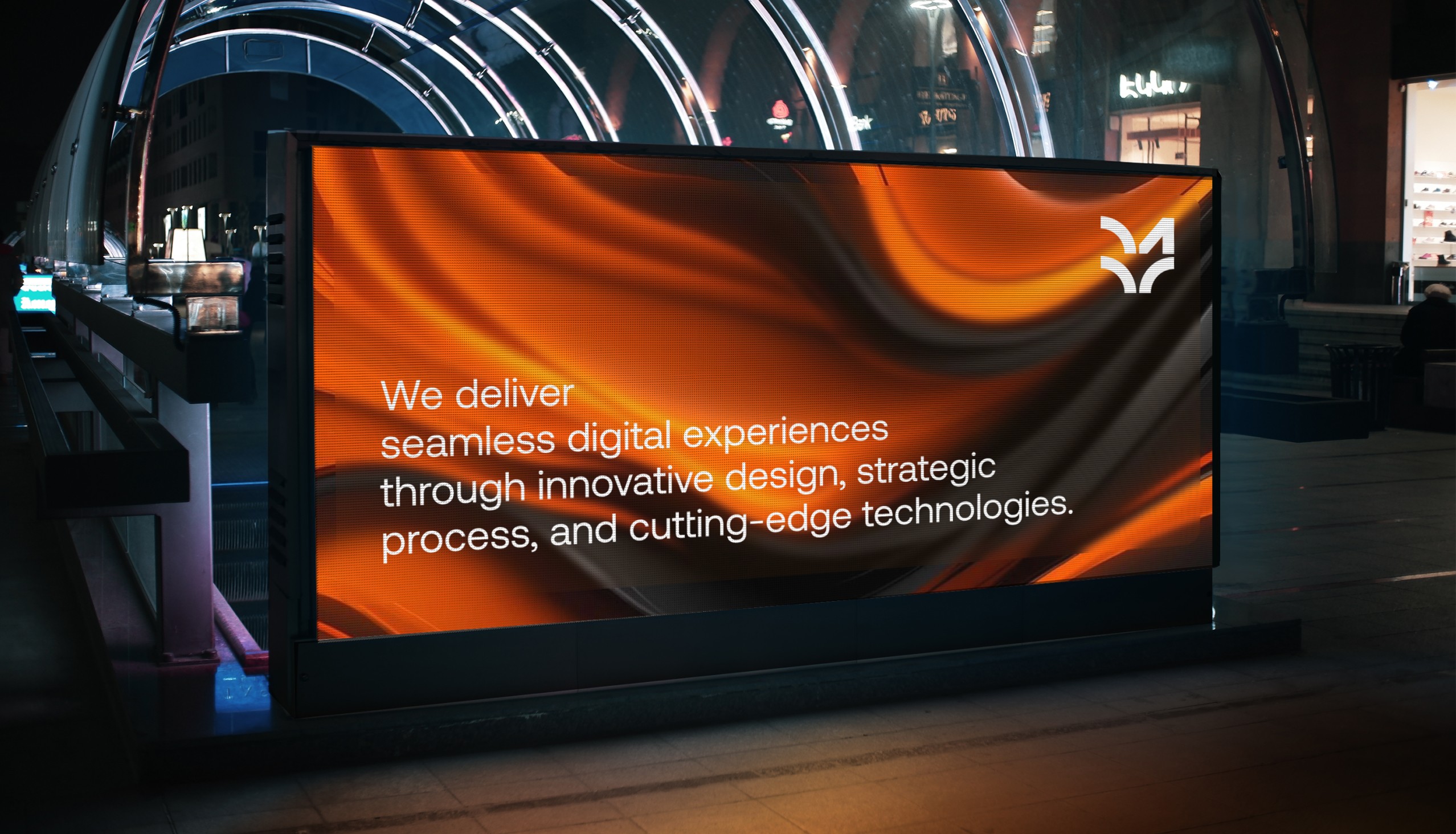
Tone That Matches Our Culture
Alongside visuals, we refined how we sound. The visual identity is modern and restrained-but the tone is warm, clear, and quietly bold. It reflects who we are: thoughtful, strategic, and not afraid to take a stance when it matters.
Tone That Matches Our Culture
Alongside visuals, we refined how we sound. The visual identity is modern and restrained-but the tone is warm, clear, and quietly bold. It reflects who we are: thoughtful, strategic, and not afraid to take a stance when it matters.


The Outcome
The rebrand brought alignment across all Enigma touchpoints-from client decks and LinkedIn posts to internal tools and the new site. It made us look and sound like the team we’ve actually become.
Stronger visual consistency across all external and internal assets
Faster design ops using ready-to-use templates for decks and proposals
Increased brand recall through a sharper, more distinctive identity
A confident foundation to support agency growth and hiring
The rebrand brought alignment across all Enigma touchpoints—from client decks and LinkedIn posts to internal tools and the new site. It made us look and sound like the team we’ve actually become.
Stronger visual consistency across all external and internal assets
Faster design ops using ready-to-use templates for decks and proposals
Increased brand recall through a sharper, more distinctive identity
A confident foundation to support agency growth and hiring


Takeaway
A bold yet minimal identity gave Enigma a confident, modern voice without overwhelming its work.
A modular design system brought consistency across all brand touchpoints-saving time and raising quality.
Clean, flexible templates empowered the team to move faster and communicate clearly.
The new brand feels like Enigma: sharp, thoughtful, and built for what’s next.
A bold yet minimal identity gave Enigma a confident, modern voice without overwhelming its work.
A modular design system brought consistency across all brand touchpoints—saving time and raising quality.
Clean, flexible templates empowered the team to move faster and communicate clearly.
The new brand feels like Enigma: sharp, thoughtful, and built for what’s next.
Next
Next
Next
Project
Project
Project
DMTCA
DMTCA
DMTCA
Think I match your freak?
Slide into my inbox- no awkward small talk required 😉
Based in DELHI

UI UX DESIGNER


Feel free to stalk me here!
Think I match your freak?
Feel free to stalk me here!
Think I match your freak?
Based in DELHI
UI UX DESIGNER