CLIENT
PERSONAL
SCOPE
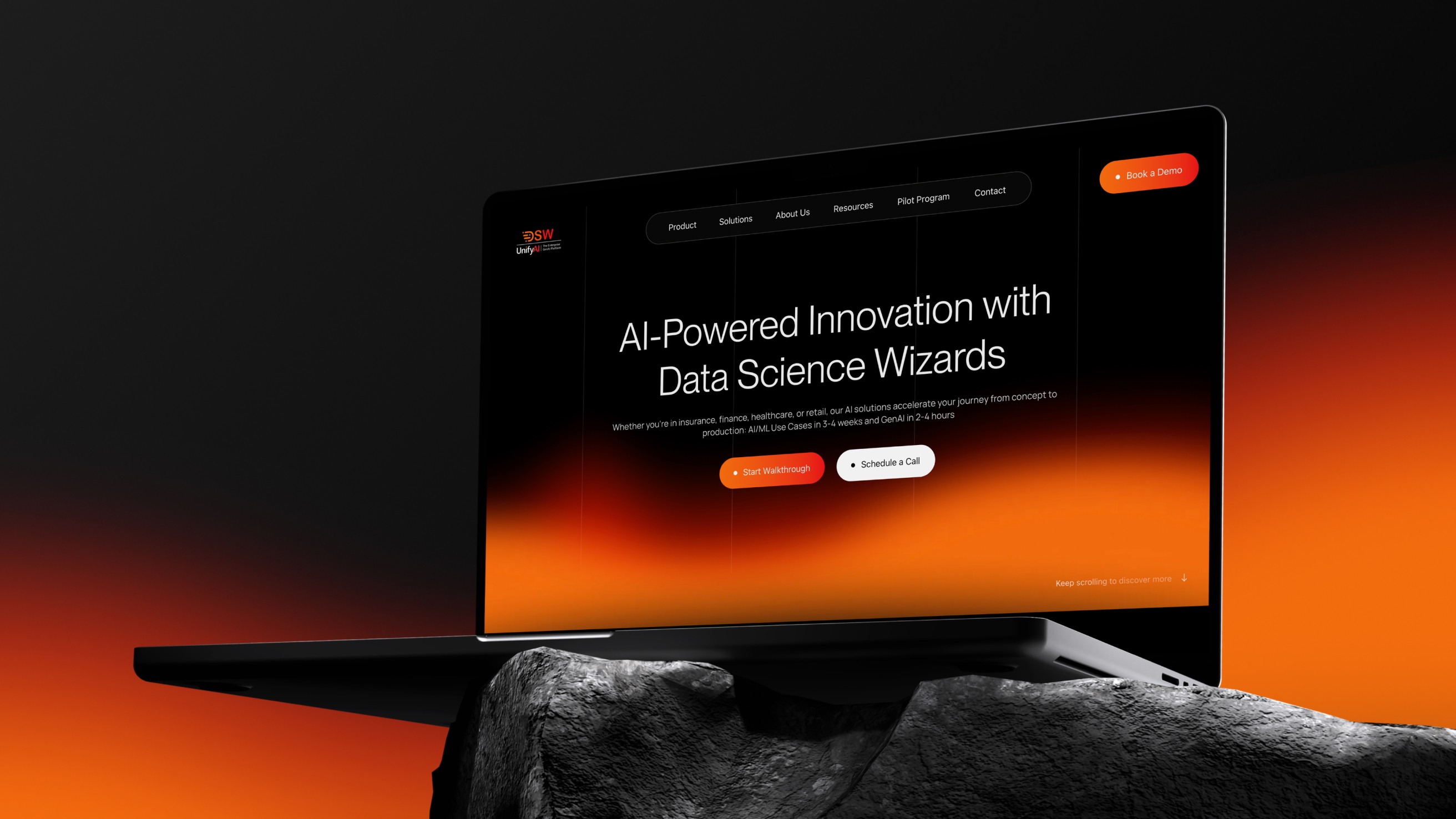
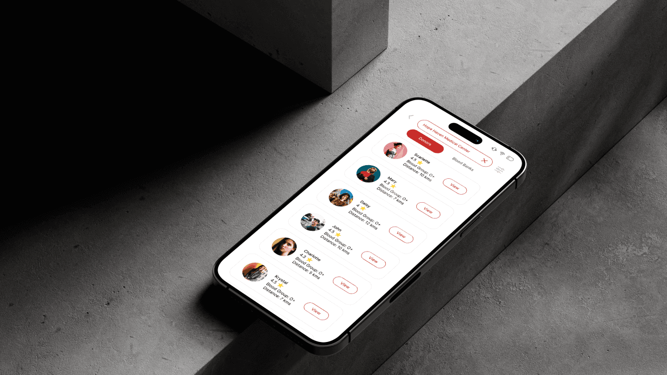
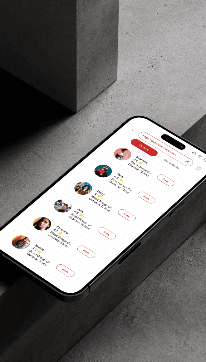
Donor Connect is a life‑saving platform designed to seamlessly connect blood donors with patients in need. It empowers individuals and NGOs to streamline requests and donations-with features like smart matching, user-friendly onboarding, and real-time notifications.

The Challenge
In emergency situations, time and clarity matter most. Current donation methods (calls, forms, informal groups) are slow, inconsistent, and often unreliable. Many potential donors are willing-but don't know how, where, or when to help.
Design Goals
Make blood donation accessible and intuitive
Reduce friction across onboarding and matching
Encourage retention through transparency and trust
Support both individuals and NGOs with smart features
Approach
Matching System & Filters
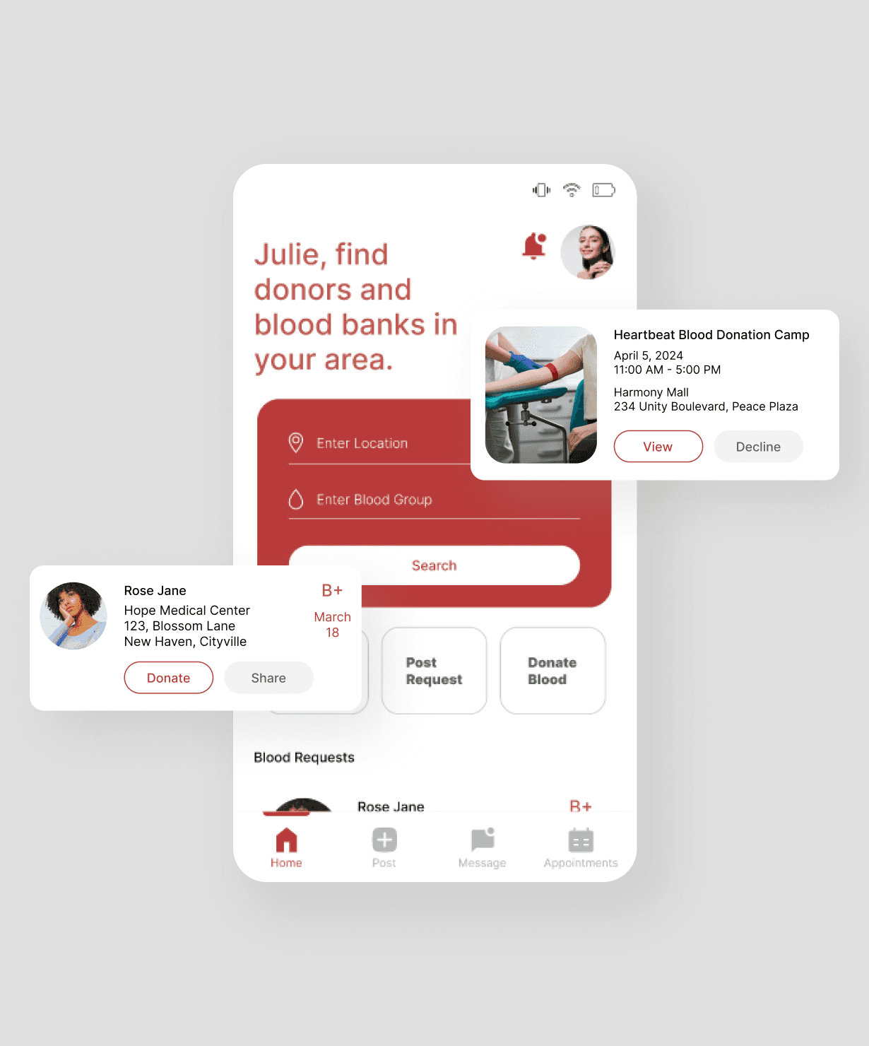
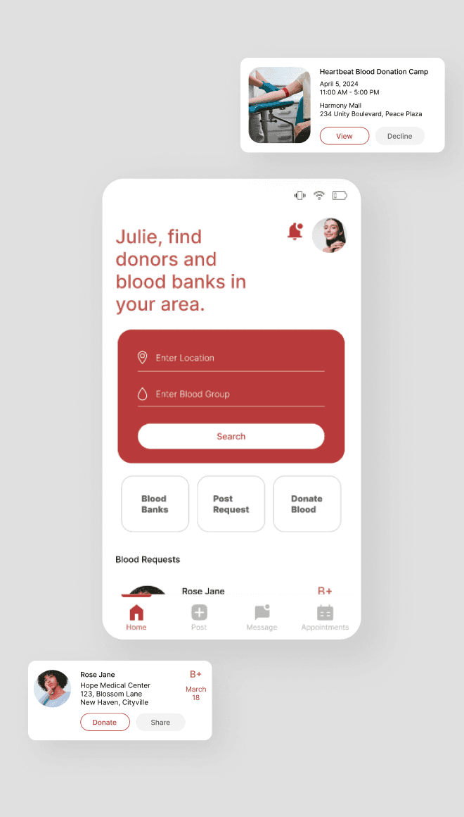
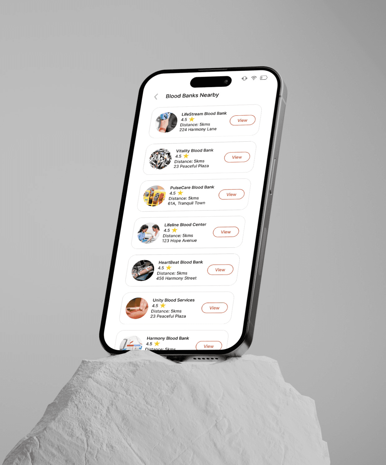
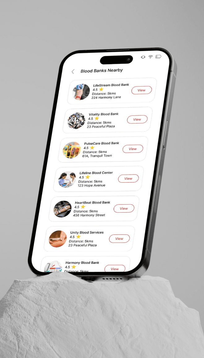
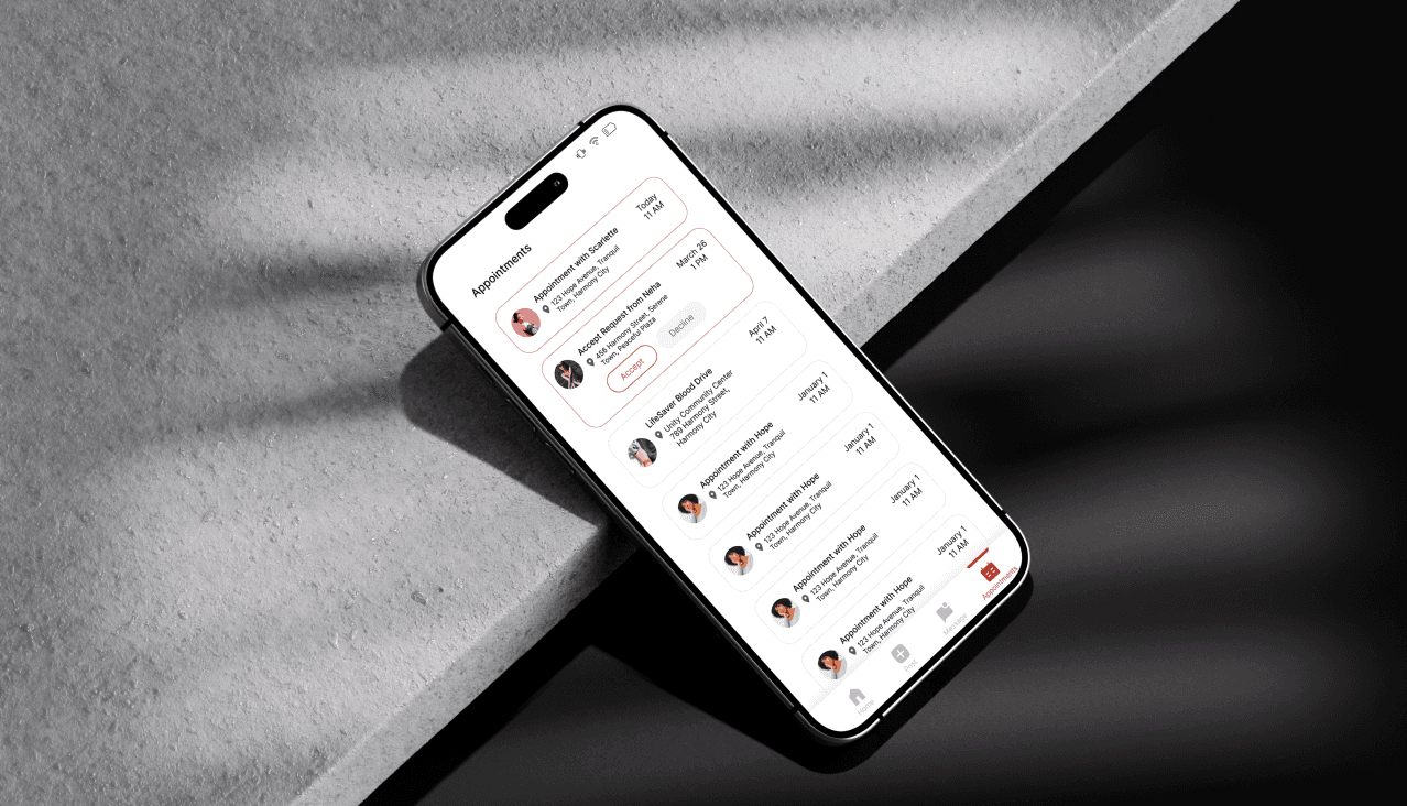
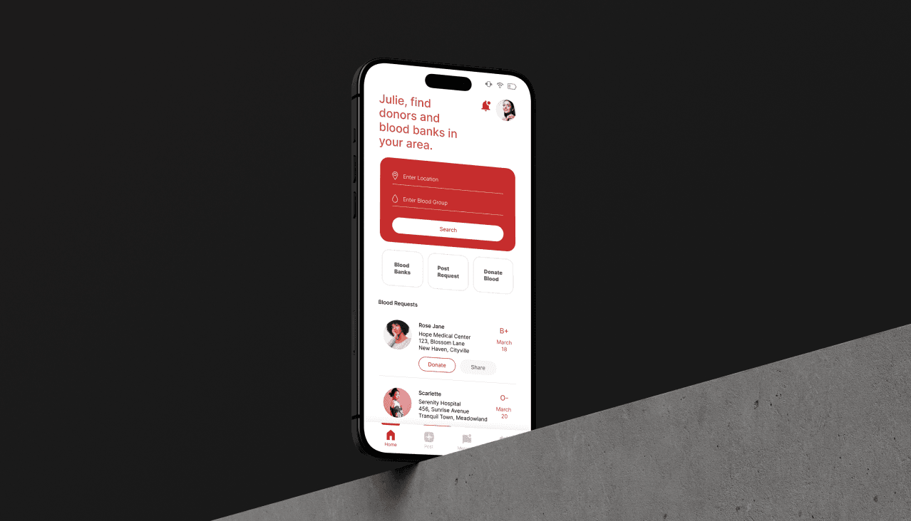
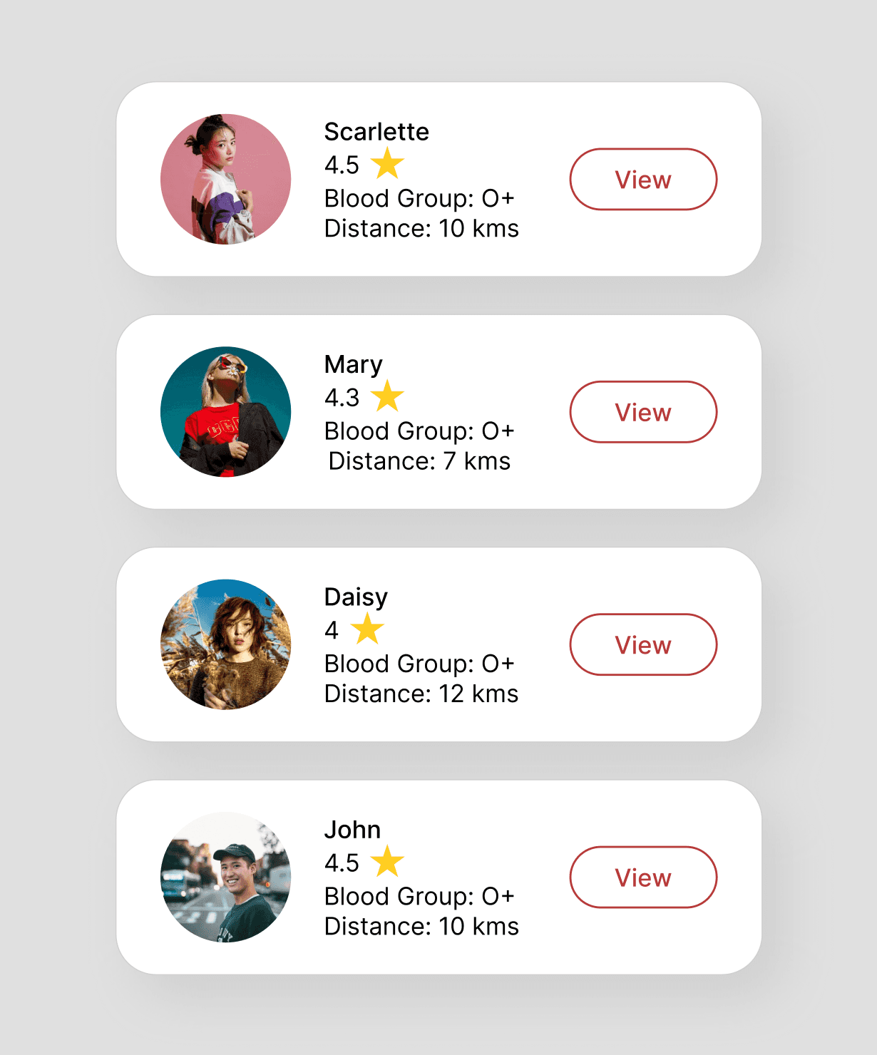
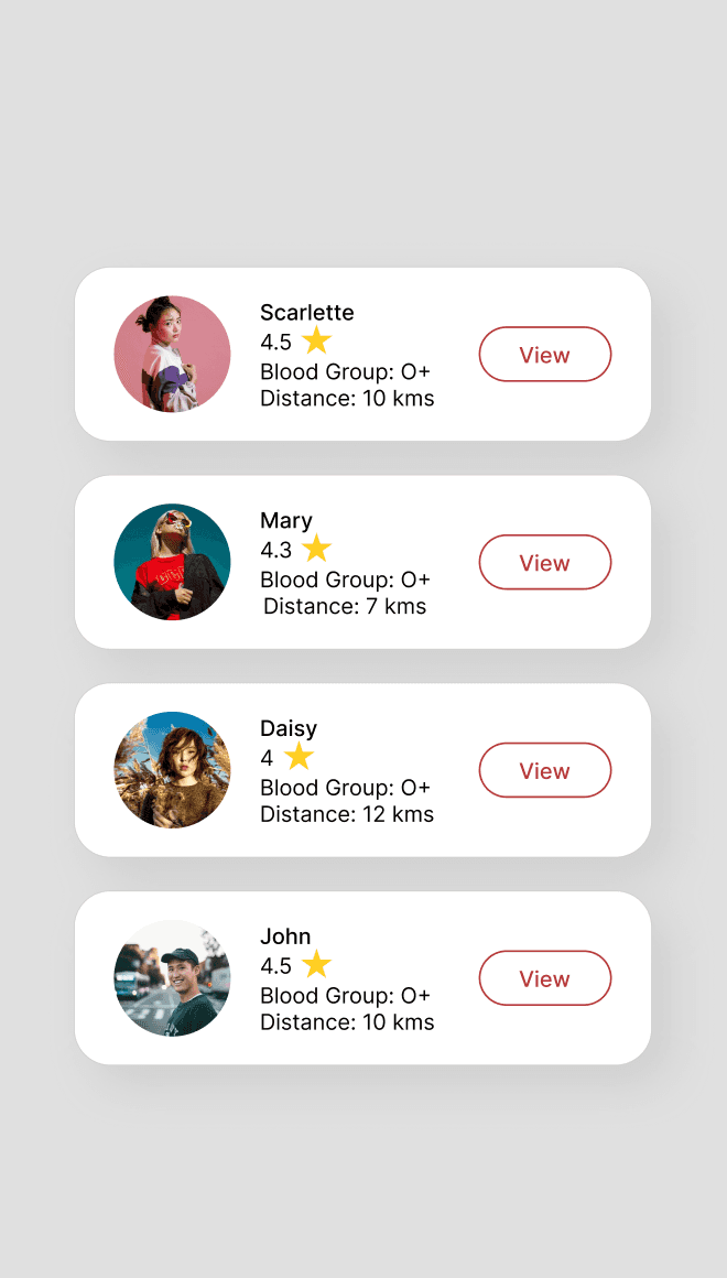
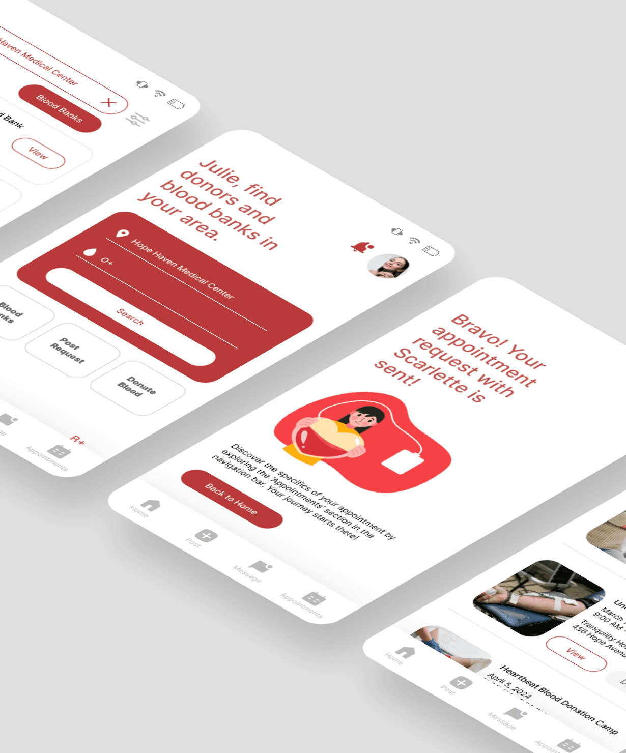
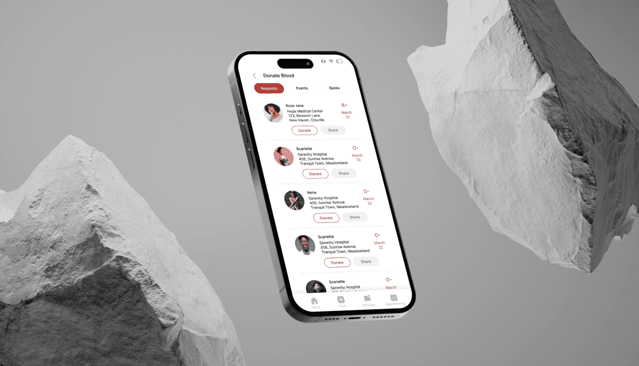
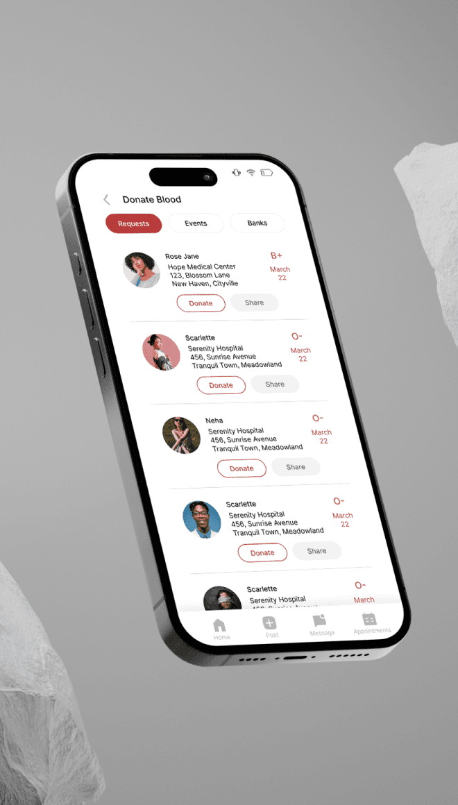
I implemented a smart filtering system (blood type, location, urgency level), enabling accurate matches and reducing wait time. The UI surfaces key details upfront, so users know exactly what’s needed.
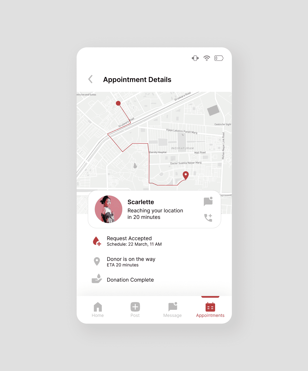
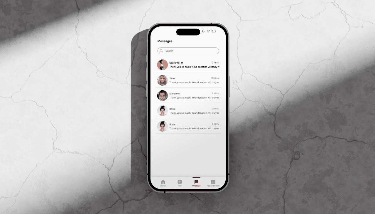
Human-Centered Messaging
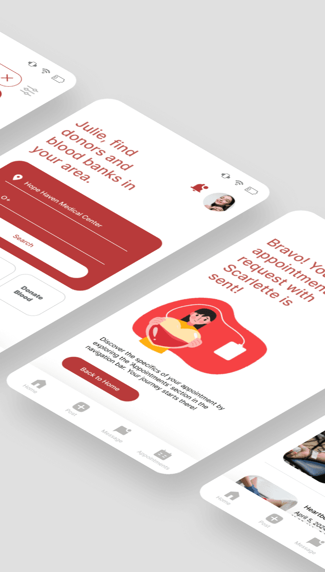
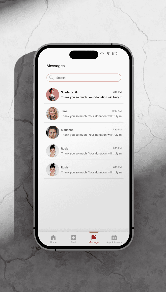
From soft confirmation screens to real-time updates and thank-you badges, the product communicates with warmth and clarity-making sure users feel safe, supported, and valued.
Built-In NGO Support
Organizations can post drives, manage donor lists, and track contributions within their dashboard-helping build a scalable ecosystem of verified requests.
Visual Language
I chose a calm but alert palette-with clean whites, deep reds, and soft gradients-balancing urgency with empathy. Rounded elements, spacious layouts, and intuitive iconography make the product feel human, not clinical.
The Solution
The final product is a modular, mobile-first experience that adapts to users’ roles-donor, requester, or organization. Every interaction is designed to reduce hesitation, build trust, and make helping feel easy.
Fast, form-free sign-up
Location-based matching
Emergency badges & request prioritization
Real-time request status
NGO-specific management dashboard
Impact Potential
While Donor Connect is a concept, its potential impact is clear:
Reduce manual coordination in emergency donations
Create a digital safety net in under-resourced areas
Build long-term donor retention through feedback & trust
Empower NGOs to run efficient, visible campaigns
Takeaway
Even the simplest flows can save lives when designed well
Empathy in UI goes beyond colors-it's in structure, tone, and timing
Platforms like this thrive on trust and clarity
Designing for critical use cases = designing without ego